Project Facts
Name of the project: La Leona – Beauty Salon
Status: Built
Year of completion: 2014
Design Team: Henri Fanthome , Aayushi Goel
Location: Gurgaon
Built up and Site Area: 1000 sft
Photo Credits: Andre Fanthome
Re– use, Re-invent, Re-imagining SALONS
A first salon for the chain La Leona is in the bustling sector 14 market of Gurgaon brings a whole new experience to Salon design
The first floor space is about a 900 sq.ft varying between 16 feet at its widest and 9 at its narrowest, and under 60 feet long was a hard space to work.
A salon is always full space, there will be bags, product, brushes, blow-dryers, trolleys, large chairs all fighting for space and distracting the eye. Anything unnecessary was stripped and removed so the feeling of space was highlighted So the Architects decided to use a minimalist and with the careful addition of the Salon’s signature red, the palate found dramatic effect.
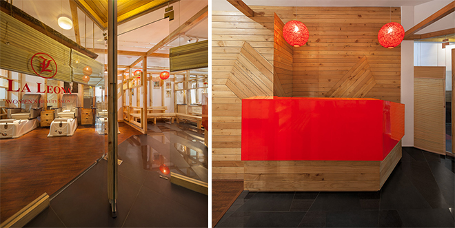
The design idea centers around a transparency and a Zen like calm that only does as much as is essential while letting the client soak up the pleasant and soothing atmosphere without distraction. Each element is carefully placed and blended to create a seamless unified experience.

The salon appears much larger than it actually is. The design relies on a series of rich timber frames that divide the space into the five sections, these frames mark out the distinct areas while retaining a spatial continuity from one into the other – enlarging the space of experience while maintaining a very disciplined segregation of function. The edgy yet texturally rich frames form the basic construct of the design.

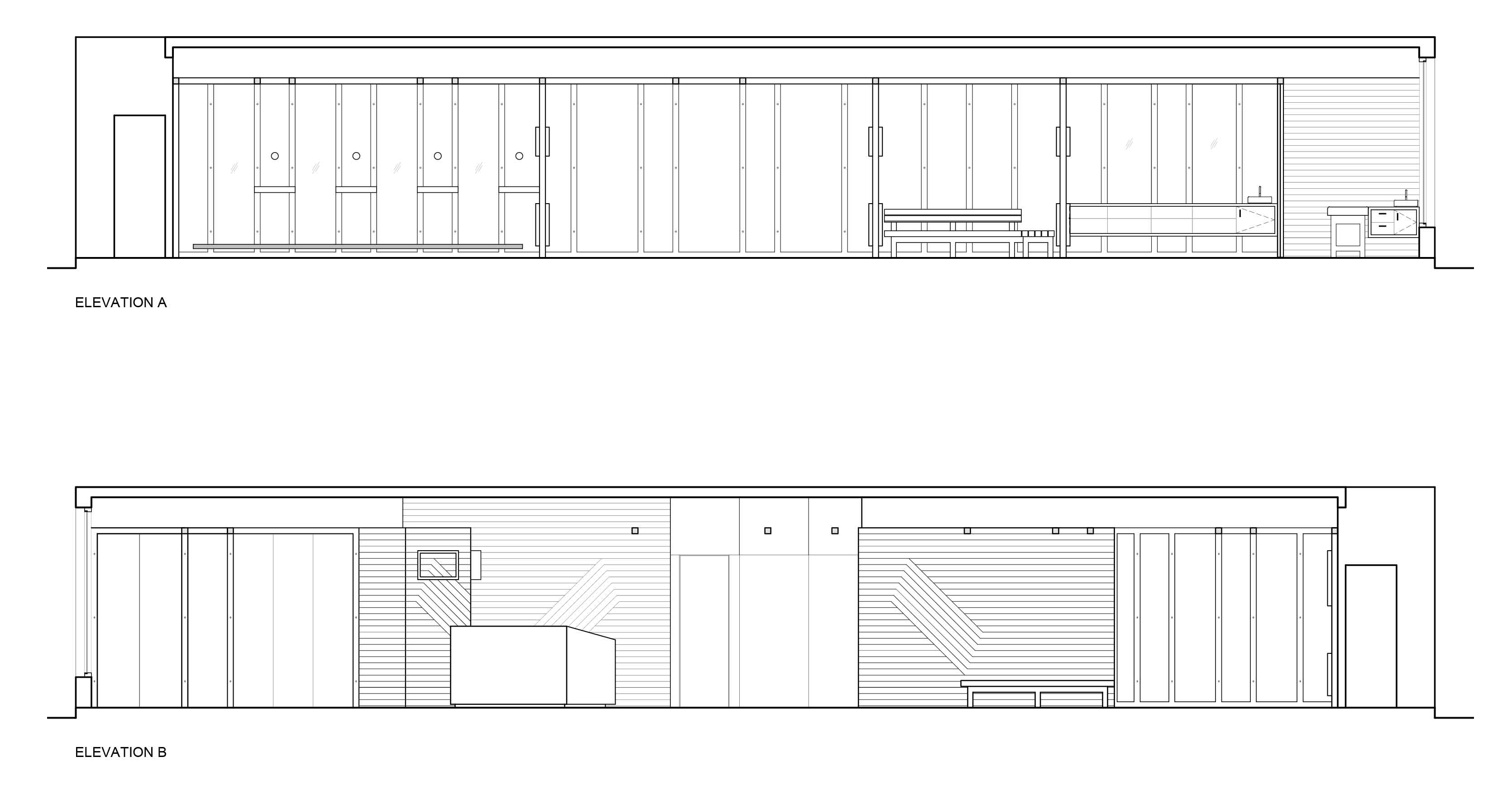
Both on the walls and overhead they define and enclose without actually creating enclosure. Within the frames then are inserted various components as functions demand – mirrors on the walls at the stations, shelves for display and storage in the partitions, and branding for products and services. Each inserted with minimal detail and fuss with joints cleverly camouflaged into the structure of the frames, and completely invisible.

The departure from regular salon design is stated clear and bold right at the very entrance. A triangular wedge of space is given over to the narrow landing, announcing the entrance. It gives you time to pause and register the act of entry. Entering a space that is clearly designed, it is unfussy, but orients you and delivers you into an experience of the whole salon as it directs you to the reception and waiting.
The wood furniture – both the reception desk and the waiting bench, are almost Japanese in their minimalist lines but are surprisingly comfortable to use, perfectly proportioned and sized with a great attention to detail.
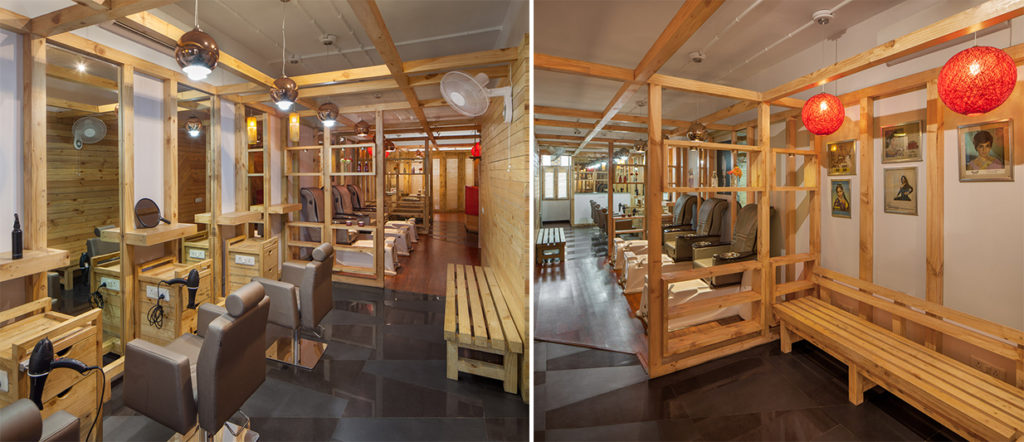
Seated in the waiting area one can see the design unfold through the space. The walls follow a pattern, white painted surface, with carefully placed series of vertical timber frames that blend into the overhead lattice. Between these are placed the mirrors, or the brand images and posters, or shelves as needed. There is a neat , disciplined right-angled geometry that integrates the many varying elements into a single larger design expression that effortlessly flows through, clearly visible and defined but not overpowering.
The space of the salon is defined by its longer edges – walls that face each other and share a similar palette but contrast in treatment. While the wall you face when seated at any of the stations is clear white with overlay timber frame what you see reflected in the mirror is similar sized horizontal slat paneling that adds perspective to the space, and a diagonal play in the pattern adds a little interest that catches the eye as you trace the length along the wood.
In keeping with a minimal essentially there is no false ceiling – a wooden lattice floats overhead that knits the many frames on two opposite walls into a unifying pattern in the space. Through it one can see overhead the conduits that carry the wires to the lights. The conduits are white and are laid in pattern of cross-crosses that complement the wooden lattice frame and marked with circular white inverted pedestals that identify the points form which each lamp is suspended through the wooden lattice frame.
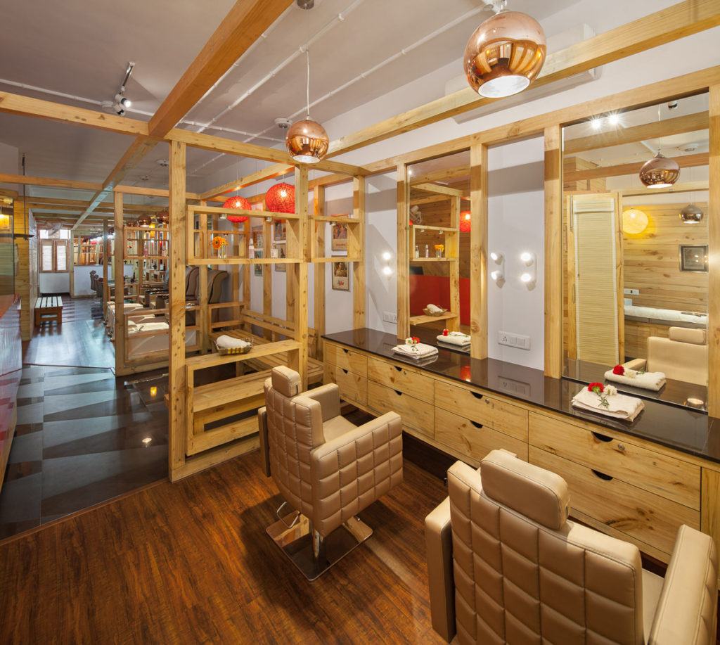
The Make up and beauty section uses carefully camouflaged collapsible wall panels to great effect here. The space can be either be four individually divided cubicles or combined into combinations by folding back the floor to ceiling panels between them and allow for fantastic day lighting as well as.
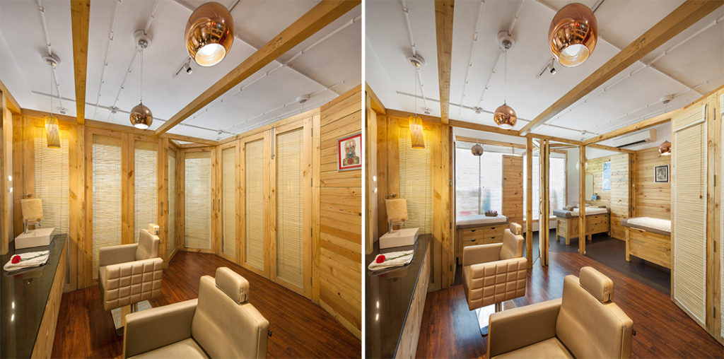
Simple yet executed to great effect. The Salon literally transforms when you fold the panels back and reveal the luxuriant treatment rooms, each carefully and elegantly appointed in wood. Inviting and relaxing even at the first glance, allowing the space to configured and reconfigured to a very varying set of uses.
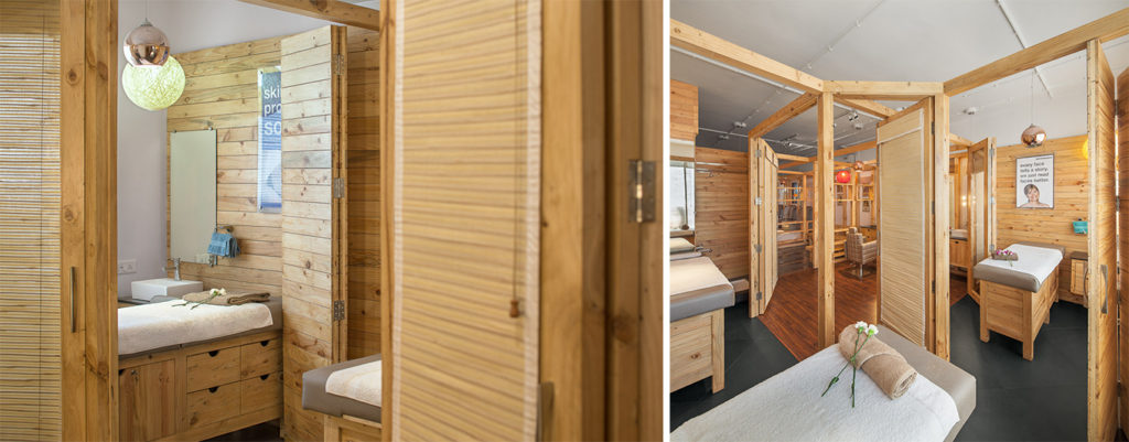
“We try to be as green as we can”. Sustainability is an attitude and an aesthetic choice as well; this clearly comes through in the Salon. One is struck by the lavish and extensive use of wood throughout the space. The wood, almost all of it is re-purposed – automotive parts packaging material that was carefully selected and put to use. The solid 3.5-inch square posts and beams, the paneling on the walls, the lattice overhead, and even the carefully crafted massage tables for the rooms, benches for waiting and the trolleys were made from the same light grained wood.
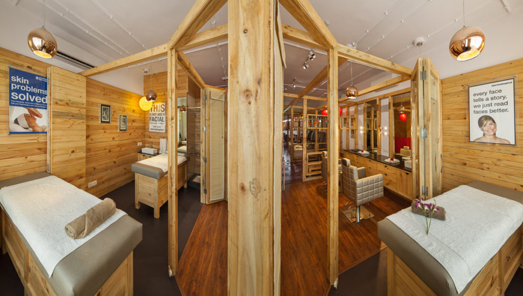
The choice was a green decision, but with a clear aesthetic vision. There is warm texture that unites all the elements across the design. This is made possible by the use of a single lot. It unites and blends elements that would otherwise have been fighting for attention.
“We wanted to see what we could achieve by making strong choices in the use of more sustainable materials”. Needless to say, using unconventional materials requires a re imagining of construction and fabrication techniques but they are worth the effort. We always believe sustainable design does not cost more, and here you can see without a doubt that is can be fantastically elegant as well.

